Art Direction
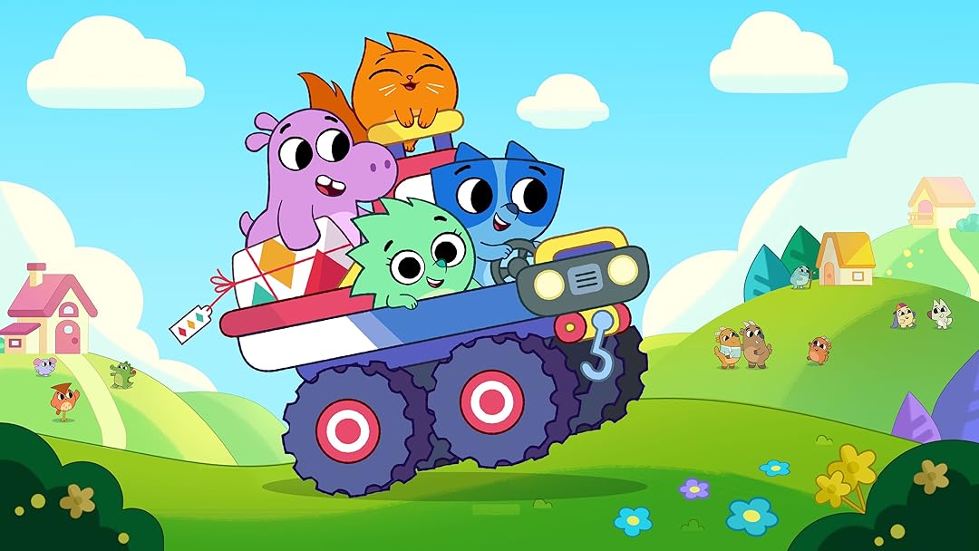
Pikwik Pack
Visual Development for a pre-school Disney TV Show
Year :
2021
Industry :
Television Animation
Client :
Guru Studio
Project Duration :
1 year
Problem :
Pikwik Pack needed to stand out in a crowded preschool animation market while maintaining a design language built entirely from simple, geometric shapes — a core stylistic choice meant to be visually accessible for young audiences. The creative problem was finding ways to inject personality, warmth, and visual depth into minimal designs without overcomplicating the look or breaking the show’s clean, educational aesthetic.

Solution :
As a Designer and Painter, I focused on enhancing the show’s appeal through color theory, composition, and texture balance. I developed palette harmonies that emphasized emotional tone and character readability, while using lighting cues and spatial layering to bring subtle depth to otherwise flat forms. Every decision — from hue contrast to line thickness — supported the show’s storytelling clarity and energetic pace.


Challenge :
The biggest challenge was working within the limitations of extremely simplified shapes while maintaining enough visual interest to sustain audience engagement. This required consistent coordination with layout, lighting, and animation teams to ensure that even the simplest environments and props felt alive and cohesive across episodes.
Summary :
Through thoughtful design and painting, I helped shape Pikwik Pack’s distinct visual identity — a bright, charming world that communicates emotion and story through simplicity. My work contributed to the show’s recognizability and appeal, demonstrating that minimal design can still deliver rich visual storytelling when guided by strong artistic principles.

More Projects


Art Direction
Pikwik Pack
Visual Development for a pre-school Disney TV Show
Year :
2021
Industry :
Television Animation
Client :
Guru Studio
Project Duration :
1 year
Problem :
Pikwik Pack needed to stand out in a crowded preschool animation market while maintaining a design language built entirely from simple, geometric shapes — a core stylistic choice meant to be visually accessible for young audiences. The creative problem was finding ways to inject personality, warmth, and visual depth into minimal designs without overcomplicating the look or breaking the show’s clean, educational aesthetic.
Solution :
As a Designer and Painter, I focused on enhancing the show’s appeal through color theory, composition, and texture balance. I developed palette harmonies that emphasized emotional tone and character readability, while using lighting cues and spatial layering to bring subtle depth to otherwise flat forms. Every decision — from hue contrast to line thickness — supported the show’s storytelling clarity and energetic pace.
Challenge :
The biggest challenge was working within the limitations of extremely simplified shapes while maintaining enough visual interest to sustain audience engagement. This required consistent coordination with layout, lighting, and animation teams to ensure that even the simplest environments and props felt alive and cohesive across episodes.
Summary :
Through thoughtful design and painting, I helped shape Pikwik Pack’s distinct visual identity — a bright, charming world that communicates emotion and story through simplicity. My work contributed to the show’s recognizability and appeal, demonstrating that minimal design can still deliver rich visual storytelling when guided by strong artistic principles.
More Projects
Art Direction
Pikwik Pack
Visual Development for a pre-school Disney TV Show
Year :
2021
Industry :
Television Animation
Client :
Guru Studio
Project Duration :
1 year
Problem :
Pikwik Pack needed to stand out in a crowded preschool animation market while maintaining a design language built entirely from simple, geometric shapes — a core stylistic choice meant to be visually accessible for young audiences. The creative problem was finding ways to inject personality, warmth, and visual depth into minimal designs without overcomplicating the look or breaking the show’s clean, educational aesthetic.
Solution :
As a Designer and Painter, I focused on enhancing the show’s appeal through color theory, composition, and texture balance. I developed palette harmonies that emphasized emotional tone and character readability, while using lighting cues and spatial layering to bring subtle depth to otherwise flat forms. Every decision — from hue contrast to line thickness — supported the show’s storytelling clarity and energetic pace.
Challenge :
The biggest challenge was working within the limitations of extremely simplified shapes while maintaining enough visual interest to sustain audience engagement. This required consistent coordination with layout, lighting, and animation teams to ensure that even the simplest environments and props felt alive and cohesive across episodes.
Summary :
Through thoughtful design and painting, I helped shape Pikwik Pack’s distinct visual identity — a bright, charming world that communicates emotion and story through simplicity. My work contributed to the show’s recognizability and appeal, demonstrating that minimal design can still deliver rich visual storytelling when guided by strong artistic principles.